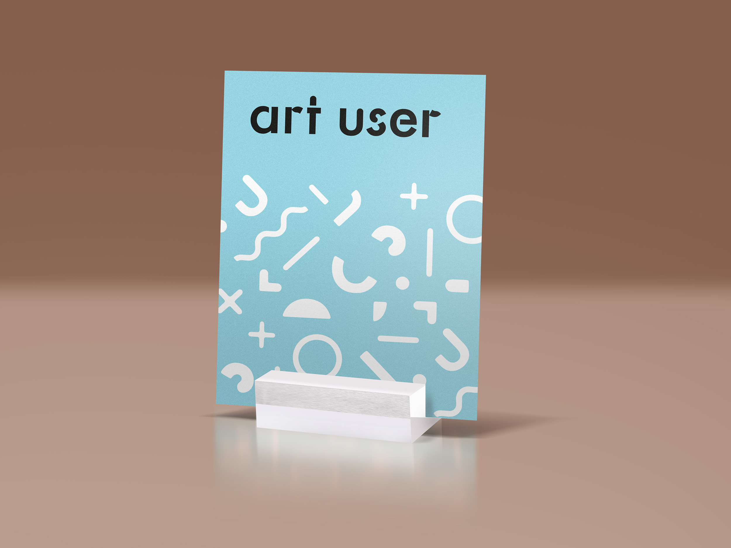
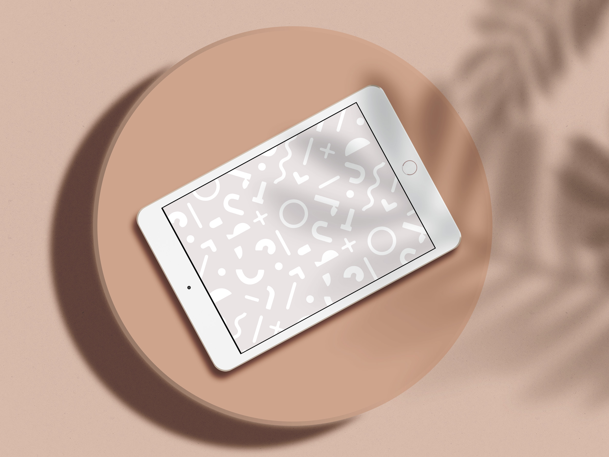
A logo and bespoke pattern for this innovative start-up, which began with an exploration of the classic Bauhaus-era typeface, Futura. In the logo the standard Futura letterforms have been broken up and playfully reconfigured, reflecting the organisation’s ethos of approaching art in new ways, questioning ideas and being open to change.
artuser.org

Identity for 365: Stories and Music, a major new collection of short stories by James Robertson, accompanied by new music from Aidan O’Rourke. All 365 stories and songs have been recorded and the interactive collection will tour Scotland in a beautifully designed sound installation in 2019/2020.
aidanorourke.net
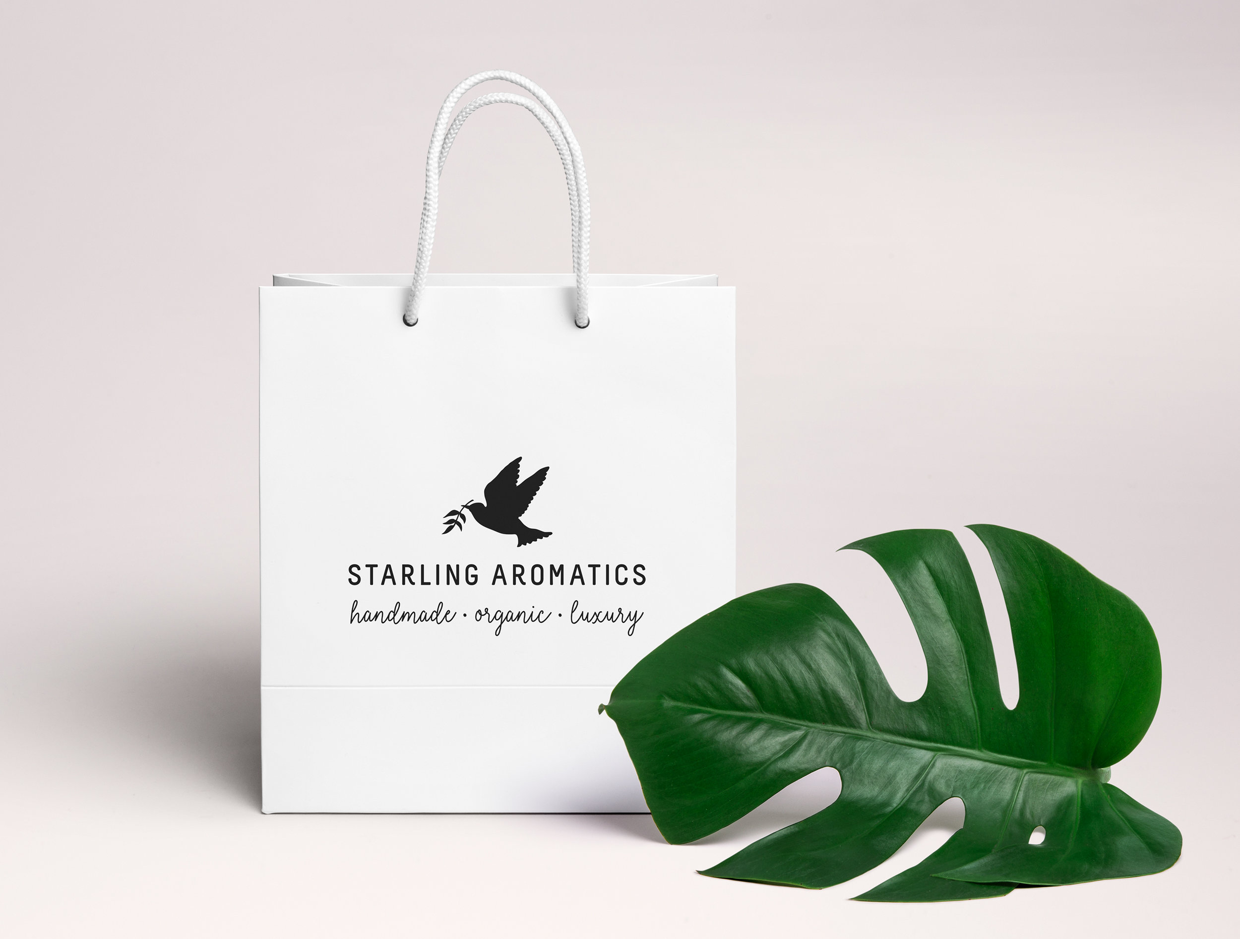
An identity for a beautiful new organic aromatherapy line. Did you know that starlings practice aromatherapy, collecting aromatic plants to furnish their nests and delight their partners?

Identity and packaging design for a beautiful new organic aromatherapy line. The hand-drawn illustrations of herbs and flowers were created individually by the label's founder, Kate MacKay.

Artsplash is a private practice providing art therapy, creative workshops and therapeutic training. The brief was to create a logo that felt playful and liberating whilst also being reassuring and calm. The solution takes motifs inspired by Matisse cutouts, which when placed above an 'l' can be read as paint or petals.
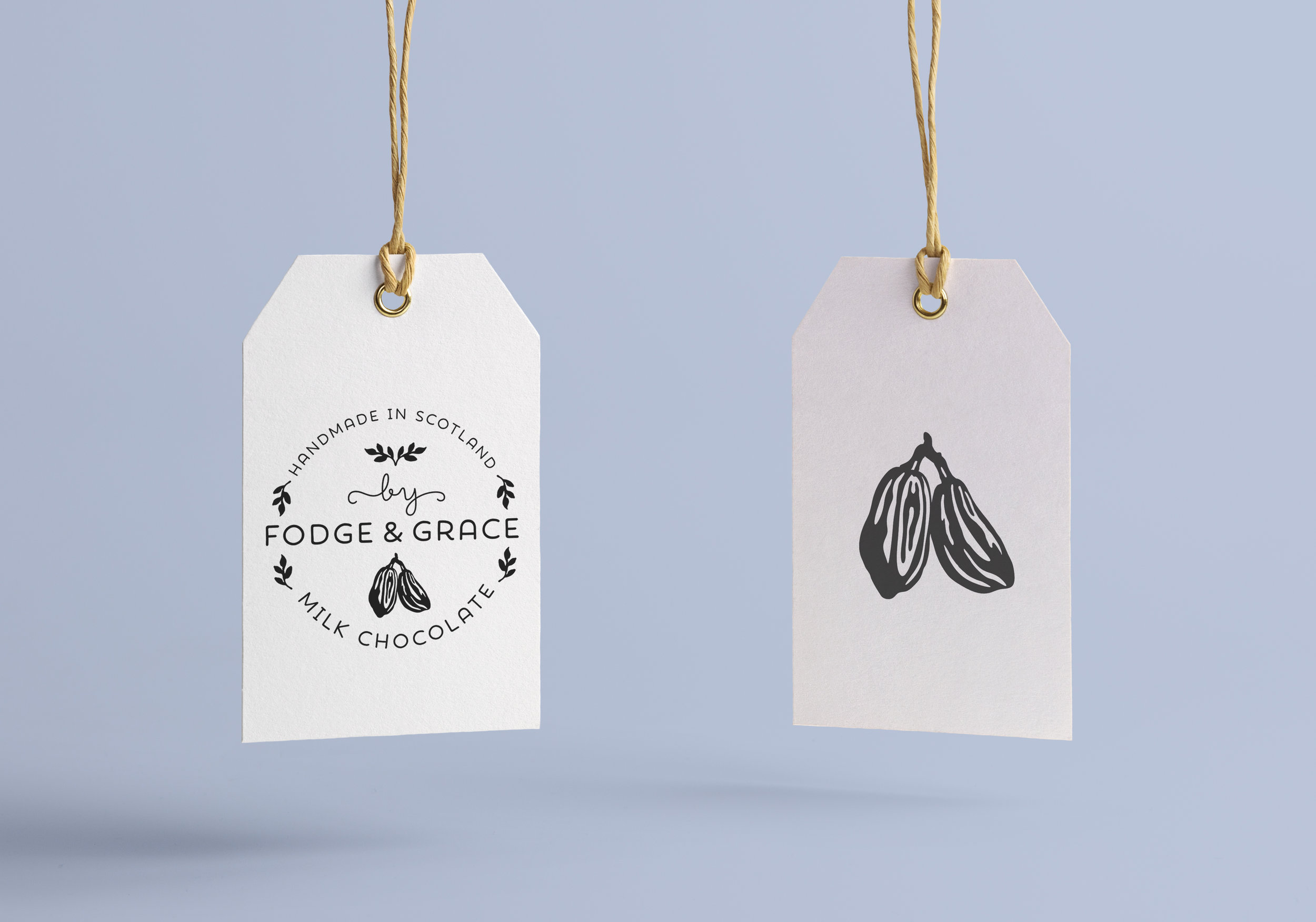
Identity and packaging for artisanal chocolatiers, Fodge & Grace. Uneven edges, hand-drawn motifs, friendly script lettering and uncoated papers all lend a small-scale, handmade feel.
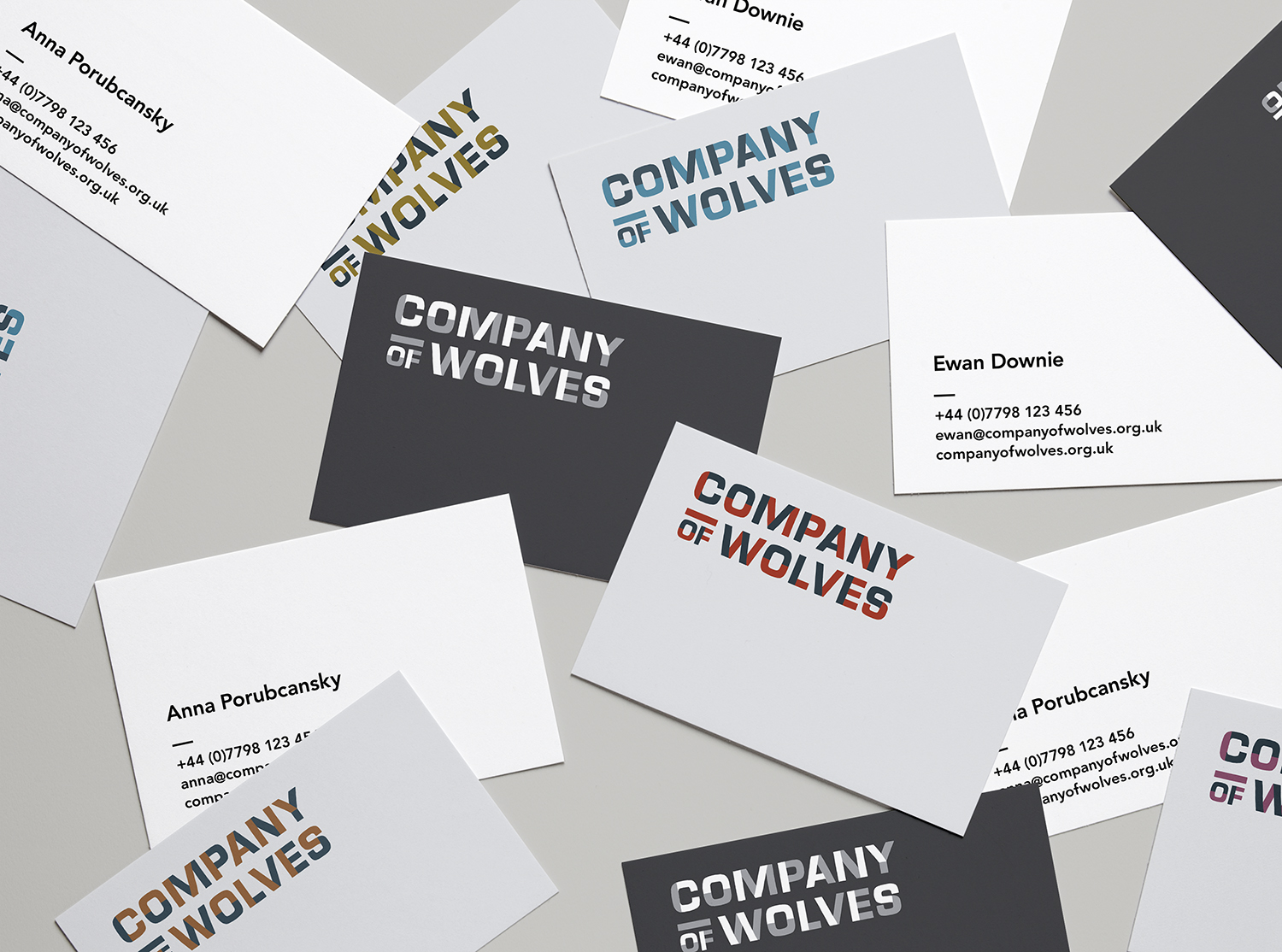
A new identity and stationery for Company of Wolves, a laboratory theatre company based in Glasgow.


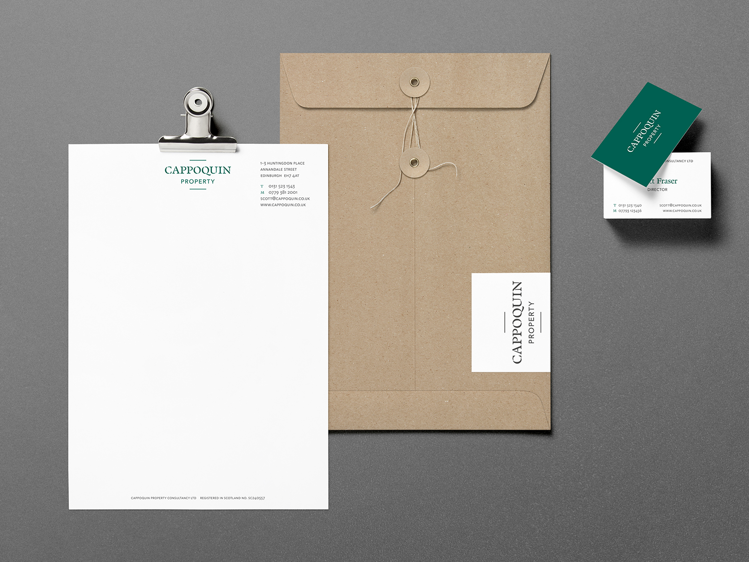
Cappoquin Property is a bespoke, residential investment consultancy. Their identity employs British racing green, elegant twisting captials paired with a clean sans serif and refined spacing to communicate trust and heritage.
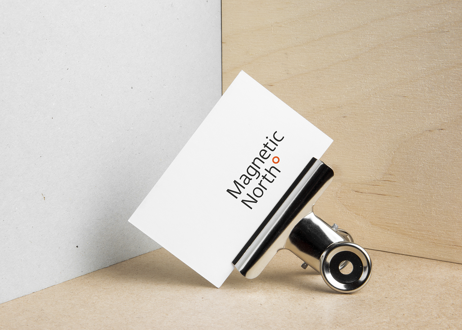
The identity for this Scottish-based theatre company uses shifting diagonals and a small degree-like icon to refer to the off-centre geography of magnetic north – which in turn reflects the company's distinctive and dynamic approach.
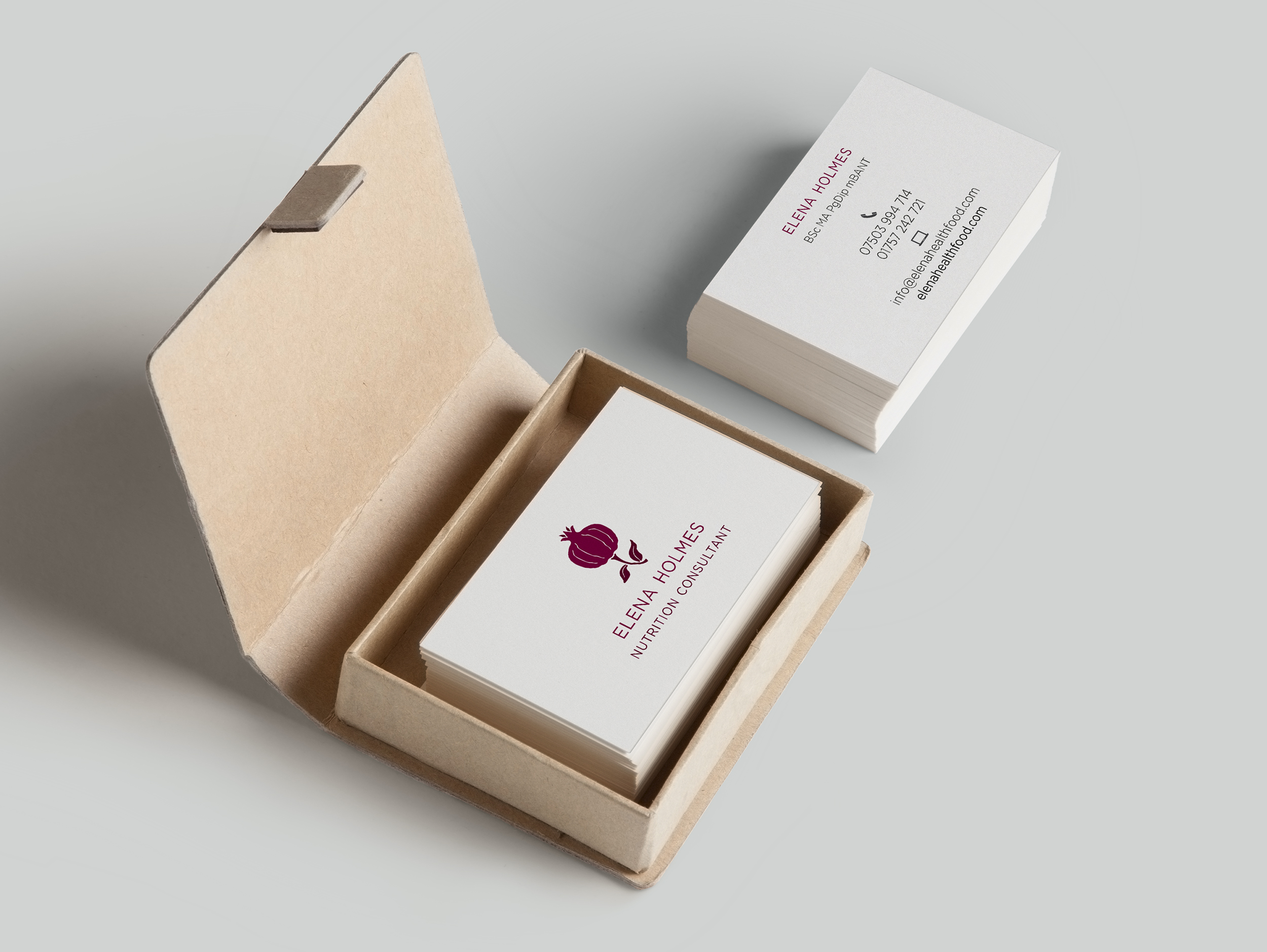
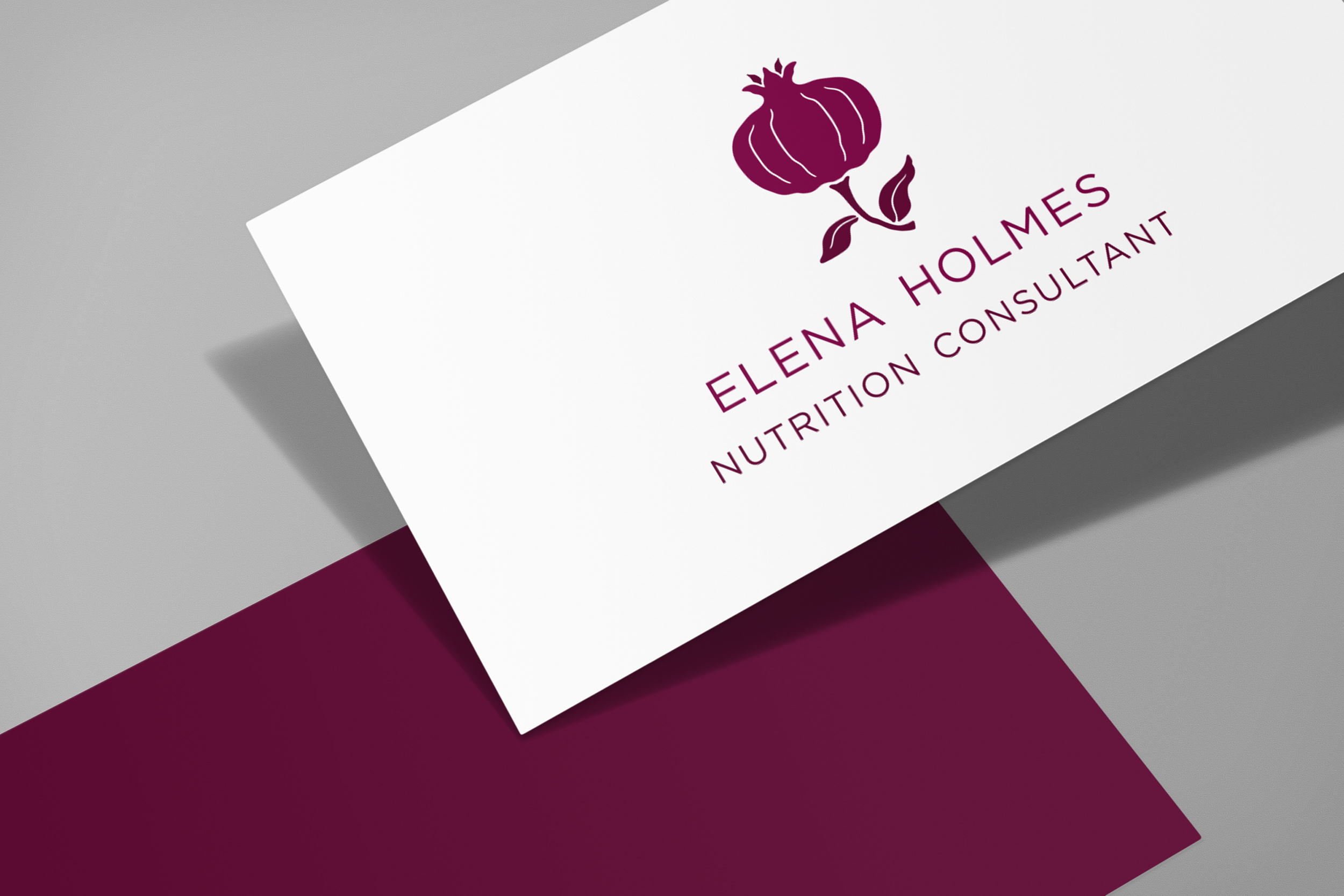
An identity for nutritionist Elena Holmes. As one of nature's best superfoods - and beautiful to boot - a pomegranate seemed the perfect choice for Elena's logo.